Workshop: outsider's view

The aim was to get an outsider's view of the project and of the website that would be at the heart of it. Specifically, I wanted to understand better what a visitor might expect to find when they first land on the site, how to explain the project very simply and how to engage the user as quickly as possible.
The 1st Workshop, with a group of three students.
This first workshop was intended to be a short, spontaneous session with the aim of introducing the group to the project and to get some basic ideas down on paper.
The 10 Most Wanted project was explained to the group using our Proposal Document, the PowerPoint presentation that we had made for NESTA and some sketches on a whiteboard.
The group were then asked what they thought the home page should convey to encourage a first-time visitor to stay, explore and join in.
The group came up with three things:
1. The site should be visually attractive
2. It should explain the project clearly and concisely
3. It must include an obvious path for visitors to register
This was hardly groundbreaking stuff, but it was a helpful exercise in explaining the project and getting some feedback.
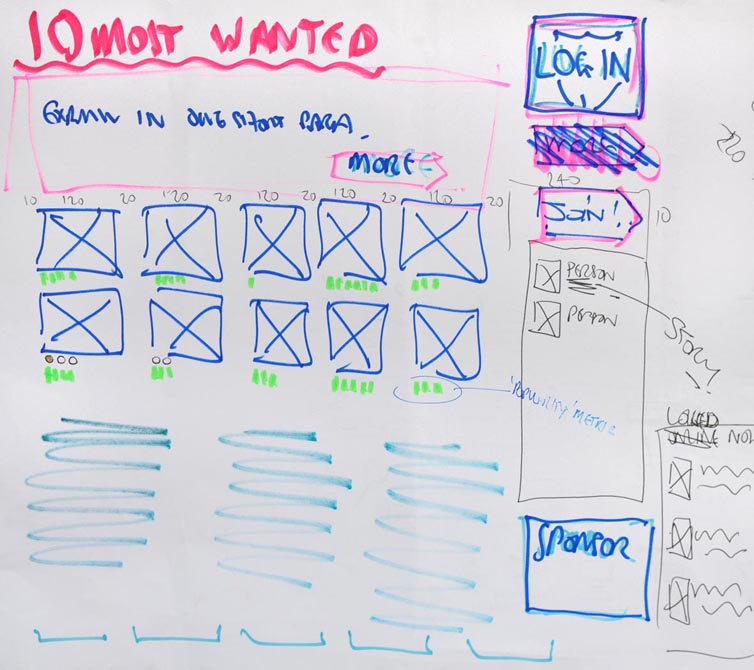
The session closed with a whiteboard sketch of a possible home page layout of what were thought to be the most important elements.
The 2nd Workshop, with a group of seven students.
As before, this started with an explanation of the project for the benefit of the new members of the group and to refresh the memories of others.
To get the discussion moving the sketch of last time had been turned into a design on paper.
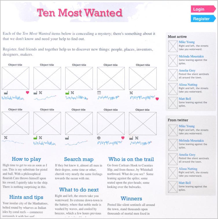
Having an actual design in front of them seemed to make it easier for the group to understand the principles of what we are trying to do, how the users might interact with the site and how this interaction might be represented.
Following a further discussion, the group were asked what home page content would make them want to engage with the site and find out more about the project.
They were given a few minutes to sketch their ideas, what happened next was unexpected but extremely interesting.
When we looked at the drawings we found that six out of the seven students had all included a map of some description in their home page layouts, see below.
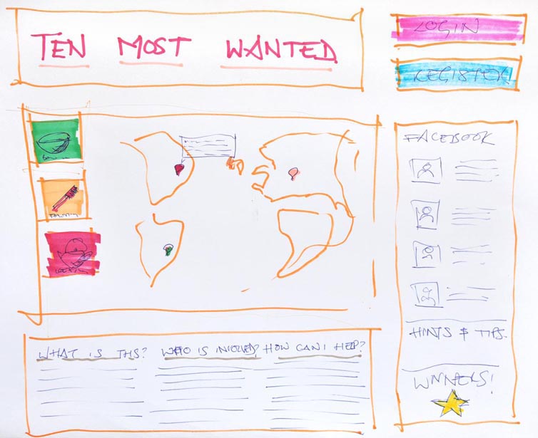
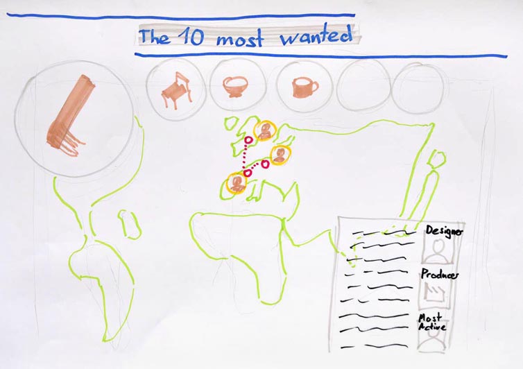
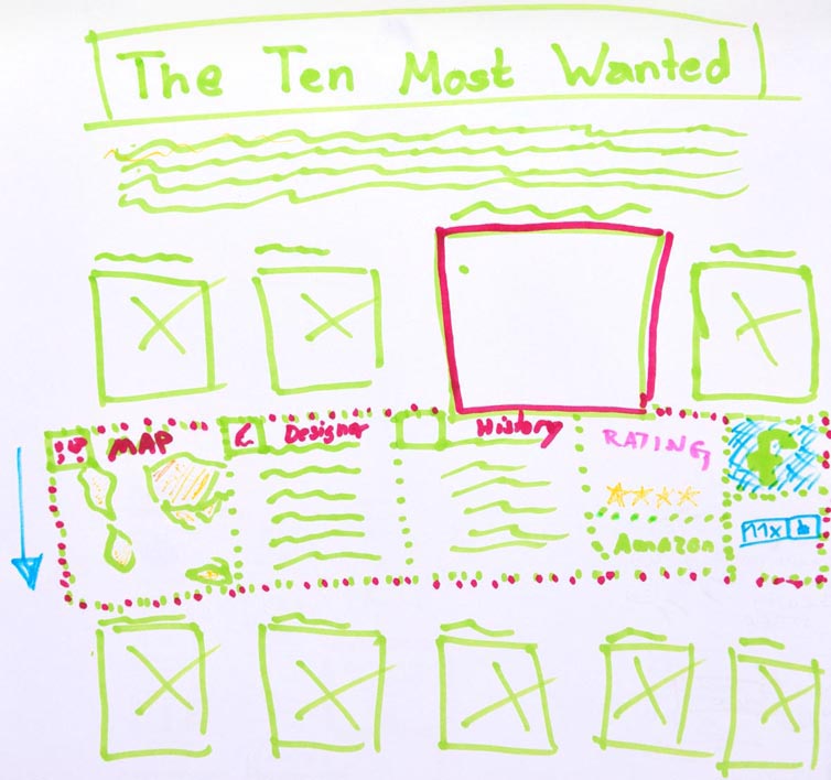
The map represented variously the geographical spread of the project, the distribution of the registered players, or the extent of the investigations into a specific object.
Along with the map there would often be lists of players featured on the home page, including their names and faces, sometimes listed as latest members, or members involved in this search, or on a feed of members’ posts on the project Facebook page or a twitter feed.
Another idea that featured on several of the drawings was that of showing which individual players are involved in which specific searches, together with a reward system of some sort that could award them a special or distinctive status.
This status was thought to be helpful, not only as a reward for those that achieve a lot within the framework of the game, but also to label these players as people who could be trusted, or consulted by the other players less sure of what to do next.
This is as far as our testing has got to so far.
Our thanks to the students: Cristina, Gonzalo, Samuel, Sebastien, Hannah, Sascha and Amelia.
 #10;</body></html>" />

