2nd UX meeting with Danny Hope

Like the first User Experience meeting a month earlier, this one was held at our base at The Regency Town House and was again with Danny Hope. Danny, looking more rabbinical by the day, is pictured below practicing the laying-on of hands at the end of our morning session.
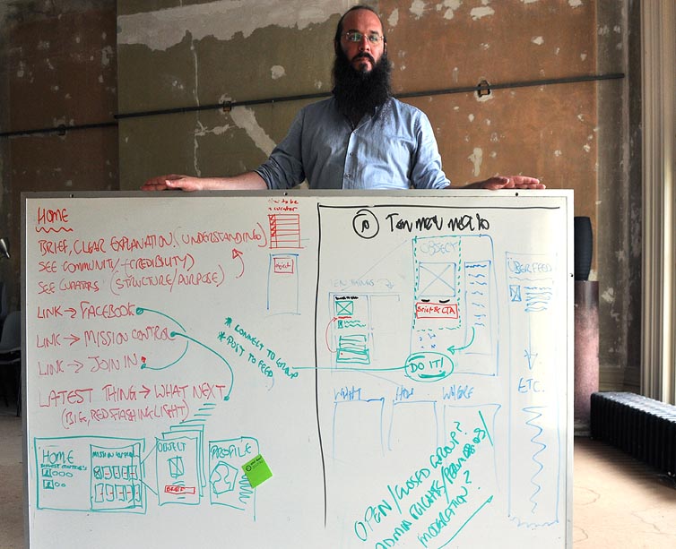
We wanted this time to focus on specific pages of the website and to decide what content would be required and where.
The home page
To my way of thinking, before anyone will consider helping to perform a task they need to understand the proposition, they need to find it credible and they need to see a structure that will enable it to happen. If we can convey these qualities then we go a long way to making our proposition more compelling.
Here are some ways we can try to do this.
Understanding comes from a clear explanation, a simple strap line, a straightforward display of proposition and solution.
Credibility comes from seeing others join in, the community expand and goals being achieved.
Structure is conveyed by organisation, the actions of the curators and the makers of the site.
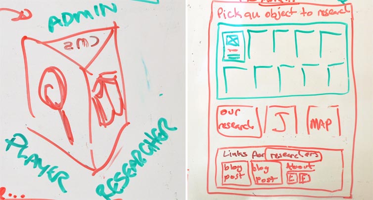
Next we began by thinking about three different types of users and the unique requirements they each have.
1. The users who come to the site to find things to search for, to join in, find their mates, see the progress, join in the discussion.
2. The researchers who come to see what we are doing, how we interact with the users, manage memberships, and who will want to find learning outcomes and other documentation.
3. The back office staff: administrators who manage the members, the programmers who try to stay ahead of the game's demands, the curators who encourage the search and moderate the results.
With this in mind we looked at the home page layout and decided to turn our original ideas upside down and put links to the partners and sponsors at the very top, add a big bold strap line beneath this, put the proposition directly below that and move the menu for researchers down into the footer where it won't interrupt potential members who are trying to understand how the site works.
There should also be links to enable visitors to join in and existing members to get to their stuff and check for messages.
We will include social media feeds to show that the community is active and a user map to show where the nearest members are.
To summarise:
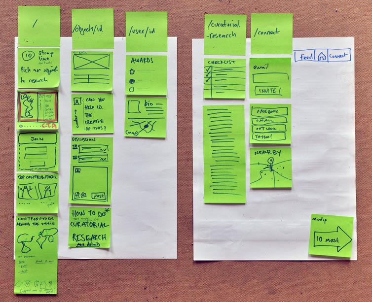
Home page
A simple strap-line
The call to action or proposition
The means to join in
Show who the contributors are
A map that shows where they are.
Object page
Image and metadata
The question: the thing we are looking for
Discussion
How to post
Hints and tips - links to how to do research, how to find stuff.
Social media feed split onto specific object pages according the object ID.
Curator/Researcher page
Methodolgy
Assumptions
Research papers
Literature review
User ID page
Biographical information
Location map
Progress and achievements
Contact link
Connection block
How to join
Invite people
Social media login
User map
 #10;</body></html>" />

